
ONE PLACE TO START WHEN PICKING PAINT
So, you are tired looking at that particular room, it has needed freshening up for a while and you haven’t got a clue where to start. You are aware grey is around a lot and so maybe you’re thinking that it might work here, in this room. But, you aren’t too sure. It’s totally a fashion and they date. And that neutral cream it got done in last time was just to freshen it up when you were in a hurry and didn’t have much of a clue, but you’d really like to have a bit of a change. After all, it’s going to cost the same anyway.
You might even have a Pinterest account (if you haven’t, you can check mine out here…I looooove a bit of browsing on there for all sorts of inspiration) where maybe you’ve been creating boards of beautiful rooms you adore. That’s always good, it’s actually what I tell my clients to do if they can, as it helps you decipher what it is you’re drawn to, even if you aren’t sure. You can begin to see a pattern emerge every time you ‘pin’ an image.
Or maybe you love the decorating programmes with all their bold, dramatic, stylish makeovers and you can’t resist the odd new housy magazine and then get all inspired that you’re going to finally do something a bit braver, with a bit more colour, in your place. And soon.
Well, here’s a way you can in 4 quick and easy steps.
It’s a way of picking a totally unique but absolutely right, paint colour. There are about a billion to choose from so if you have a go at this method, which I use quite a lot, you’ll narrow that figure down to just 1!
THE ROOM PAINT SELECTION METHOD I SOMETIMES USE
- Choose your favourite piece of art
- Make a list of all the colours you see in it
- Ponder and pick one you love and one that will suit the existing items, eg the floor, a sofa, whatever you need to keep
- Get some sample pots in that colour and test them and THAT IS IT!
Sound Simple? It is! It’s a straightforward plan to give you fabulous results.
Now, I’m going to walk you through how I did just this in this client case study, so you can see it all in action. It’s quick, easy and it works.
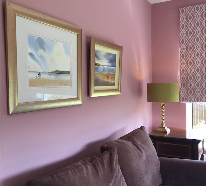
HERES HOW I USED IT – Sitting Room Makeover
- CHOOSING THE ART
My lovely client showed me a few pieces of art she loved and wanted to keep and I asked her to pick her favourite…the one she’d want to hang in the most prominent position and this was it:
- LIST THE COLOURS IN IT
I had a close look at the picture and pulled out the main colours. Here are the colours that I see in this art: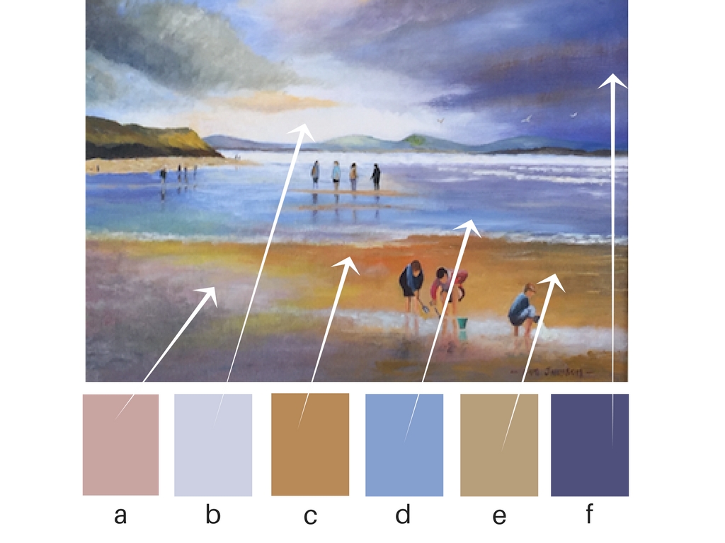
a. blush pink
b. pale blue-grey
c. mustardy gold
d. mid blue
e. warm sand
f. deep indigo
(the names are my made-up names)3. PONDER OVER THEM
Now, a wall colour based on any of those will look lovely with this picture (because they are actually in it), so now all you have to do is see which actual one speaks to you the most. Which one you’re drawn to. Don’t be in a big hurry to ditch colours, they are all possibilities.These colours are the starting point to have a good think about. In this room, the other things I had to consider was a brown sofa, beige carpet, a few gold coloured picture frames and some antique dark brown side tables.
Now, for me it was either a or f, but then I knew the client, what she liked, what else was in the room, what colour it had been, what colour the hallway leading to it was, what style she liked, how brave she was (I always like to push this a weeee bit!), how much light it got and so, taking all these into consideration, I could narrow it further and chose the BLUSH PINK.
By the way, you can do this by getting a paint colour card from anywhere, any brand or paint manufacturer, but the top two I tend to use are from The Little Green Paint Company and Farrow and Ball (click their names to be taken to their websites and order your free colour card).
This is a couple of cards from Little green on my desk and why I like these is because I can fold back the little chips and lay directly on the picture. You can see how the top pink one is lifting off. And the fab thing is these chips are the actual paint – not simply printed like many others.
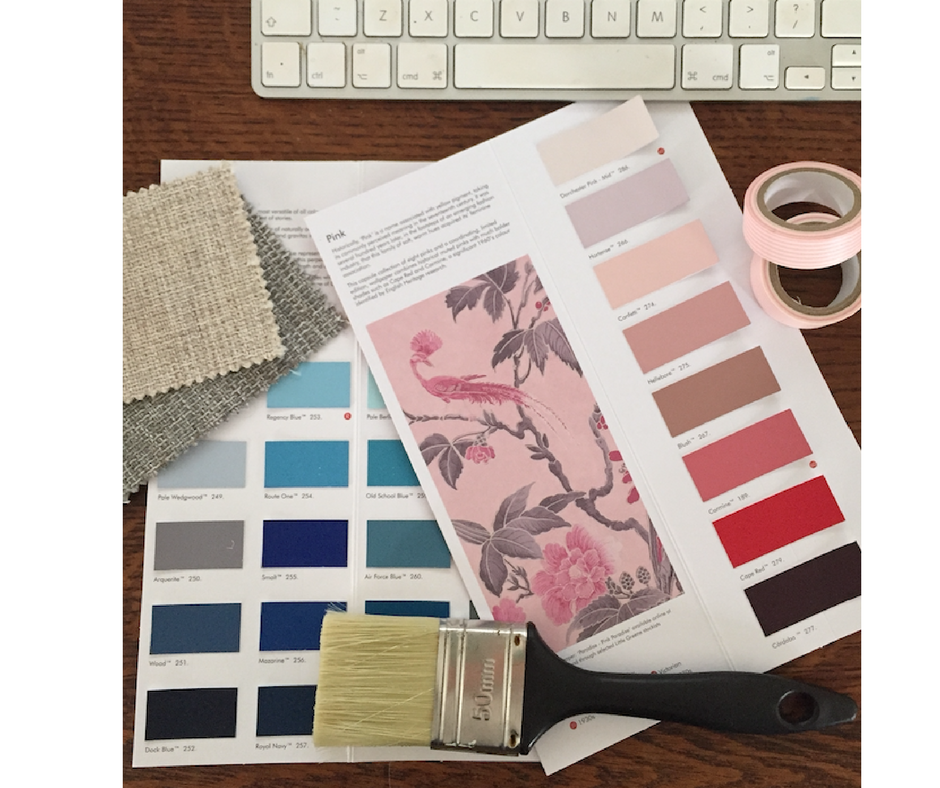
So pull these off, or cut them out when you have found the best match to the colours in your picture. Lay them down in the room preferably and go ahead and choose one, or two at most.4. BUY SOME SAMPLE POTS
Now you have your colour, which for me was a blush pink. The next thing I had to do was get some tester pots of that colour to further identify and pick the exact exact one!I got 4 sample pots:
Calamine – Farrow and Ball
Setting Plaster – Farrow and Ball
Confetti – Little Green
Hellebore – Little GreenThey are all a shade of light dusky pink. Then I painted them on a piece of white paper and viewed them in the room…this picture was taken in artificial light which is why it looks different than when on the wall below.
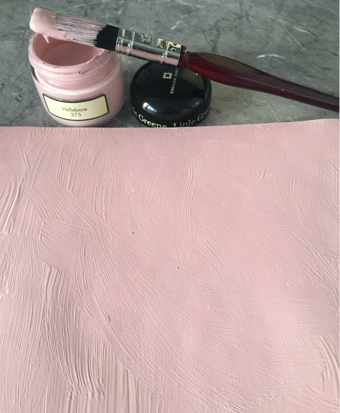
This hellebore from Little Green was perfect, so that’s simply how you do it!
How beautiful does this look?!
The Roman blind fabric was picked after the paint, as the room colour was more important in this case (I usually do it the other way round).
If you want to learn more about choosing paint and colour and build your knowledge and confidence on how to make better choices of paint, I have a mini online masterclass programme called Magnolia to Marvellous which you can find out more about HERE. It’s for you if you want better results and stop wasting money on the wrong colours (you end up living with).

Recent Comments