

HOW I CREATED A WHOLE HOUSE COLOUR PALETTE
A little while ago I was asked by a lovely lady to come in and help her design her whole house which she had just bought. She was overwhelmed with the fact that every single room needed doing and she hadn’t a clue where to start!
She needed rescuing as she was on her own with it and at her time of life felt like she wanted to live somewhere that brought her peace and comfort and a little luxury! And she really wanted to reach a stage quickly, where it was all totally finished so she could kick back and enjoy life.
How great would that be? A home that’s all done, decorated and all sitting beautifully?
I was so excited because I knew that I’d be able to create that very important colour flow throughout, which doesn’t always happen when just working on one room at a time. I am such a huge lover of colour and am fascinated by seeing how designers combine different colours together in one room.
I love love love reading interior magazines, but the main thing I’m seeing as I flick through them, over a coffee, is the use of various colours working together which make up interesting and rare room colour schemes. And particularly the bold and the daring colour combos, or just the unusual colour ones such as emerald with navy and a pop of orange, or pinks and greens or pinks and corals (more on that later).
Colour and combining colours into room schemes is at the heart of every room I design, so I wanted to share with you here, how exactly I came up with a palette for this particular whole house. There is more than one way to do this, but somehow, this way worked perfectly this particular time. So, if you are ever faced with a similar task, you could just do what I did!
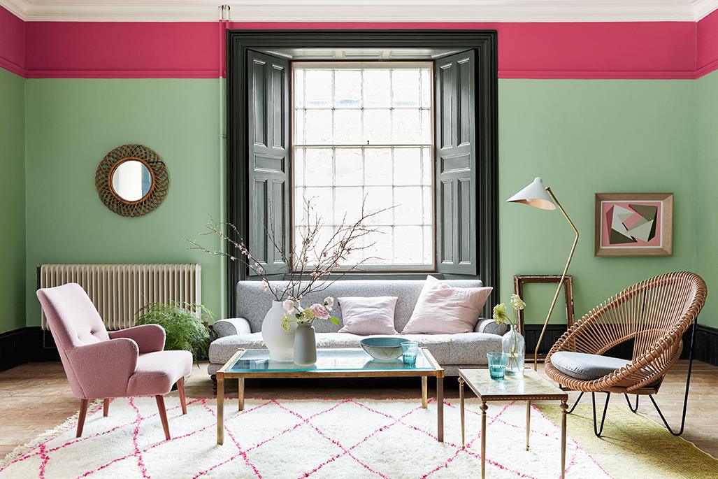
But first, I wanted to show you this, a lovely photo from Little Green Paint showing the way this room has been decorated and how they have used that gorgeous pink/green blend! You might find the top cerise band a little hard to live with, but if you cover that up, the rest is simply lovely and the point is, the walls most definitely aren’t beige!
Now, most of the people I work with have brought me in because they are simply scared and terrified of using colour. We all have colours we don’t like and living with one we really despise can be excruciatingly annoying, like when you move into a new house and you’re stuck with hideous, garish choices or you just redo a room and get it oh so wrong…I think that’s why people are so apprehensive about committing!
I find people generally do like and want to live in colour, but are petrified of overdoing it, so they underdo it and end up with bland bland bland!
So, anyway I wanted to share with you the way I approached this whole house, which was essentially a blank canvas. I was tasked with choosing the palette for every room which could include new flooring.
Basically, it was a shell.
Eeeeeeekkkk…where to even begin?!?
Now the thing is, with colour flow its important that all the colours, from room to room, work well together, so when you are looking out from one room, through to another, everything should be good together, that is, they shouldn’t clash or jar, they should flow smoothly and follow some basic colour rules.
The challenge was that I wanted to give each room its own unique personality. This is really important because each room needed to feel different.
Gone (and I’m very glad about it) are the days where minimal was all ‘in’ and people had everything the same throughout…same flooring, same neutral wall colour. What a crashing bore that was! Thankfully, I was busy with my hand painted wedding stationery business at the time and moved into interiors at the tail end of that (dull as dishwater) trend.
So here’s the 4 STEPS I took to make sure each room looked gorgeous, with its own individual colour scheme, while creating that soothing and calming and aesthetically pleasing flow!
1.FIND THE STARTING POINT
When faced with this blank canvas I had actually no starting point, so to find one I then had a little bit of investigating to do…
I needed to know other details, like:
– what, if any furniture had to be incorporated
– how my client wanted her home to feel
– what style, if any, she was drawn to
– her own likes and dislikes
and generally, uncover any clues which would eliminate certain colours and hopefully highlight others.
So, the investigation began with my detailed client questionnaire. It’s what I send people before we start work and I ask them to fill it in and return it to me before our consultation. That way we hit the ground running, I will already have found out a fair bit about the job, so no time is wasted. And they have thought long and hard about what they really, really want.
Anyway, she told me that she was starting from scratch, had a few classic dark wooden pieces of furniture, a couple of double beds and a few other bits which we could use, or not.
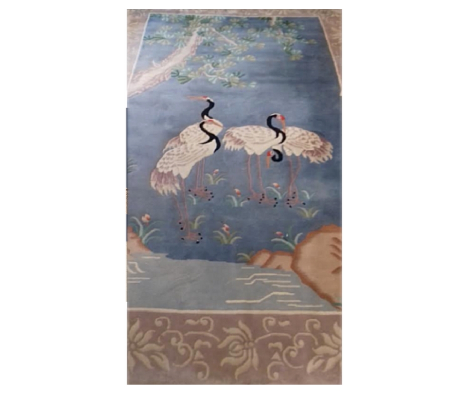
But one thing she had was a rug.
She had brought it from her last home and would love to use it. Now, when I heard this I had a light bulb moment as this is the very thing that can be THE inspiration for a whole palette.
AND IT WAS!
The rug was a lovely pattern of unusual birds and all I can say is that at first it I wasn’t too sure, but the more I studied it, the more the idea that this could be the source of all colours, became a decision. And the more I realised that this was special to her and had some warm family memories attached, the more I knew I needed to make it totally work for her.
That way her home could be all about her, which is just the way interior design should be. It’s a bit like the way a personal shopper can find you an outfit for a special occasion that fits you comfortably, suits your shape and makes you feel great…I do that for people’s homes.
I could see that the colours all sat together beautifully in the rug, so right there was my whole house pallette…on the floor in front of me!
Love those moments!!!
Here’s quite a bad photo of the rug, so sorry!
I just snapped it quickly with my phone, but you can sort of see the colours…
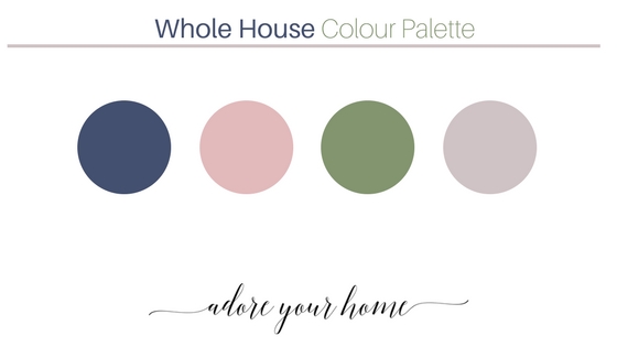
2. PULL OUT THE COLOURS TO MAKE UP YOUR PALETTE
So, next was where I chose the colours…here are the main ones…blue, blush pink, leaf green and a warm grey. There are others but these were the ones that jumped out. So this gave me a foundation to build on.
At this point, I wouldn’t select the exact paint colour but just held these as a colour reference blueprint for the whole house colour scheme.
Choosing the exact paint colour, brand and tin usually comes last, but as long as you know that ‘petrol blue’ is the colour for the room, you’re good to proceed!
this was the way my desk looked while tweaking and designing this home!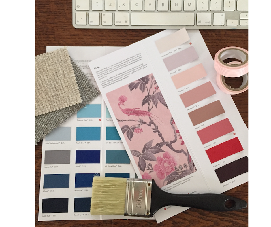
3. WORK OUT WHICH COLOUR IS SUITED TO WHAT ROOM
I now needed to work out which colours to use in each room, so I made a list of the rooms and we chatted about how she really wanted each room to feel like.
Usually when I’m doing this with people the most common answer is ‘bright and airy’! I know what people mean, it’s usually about wanting their home to feel larger, but this can soooo be achieved by other methods that mean you can use a deeper wall colour and it won’t feel dark and dingy at all!
Promise!
I usually follow that up by asking do you really want to sleep in a bright and airy room? Or would a cocooning, restful and warm vibe be better?! Just sayin’!
Anyhow, we worked through the home to decide which room would predominantly be which colour. Obviously, if a room’s main colour is eg. blue, there will be a second colour which may well be the neutral and a third colour that will be only used in small amounts as an ‘accent’ colour. I had to bear in mind the amount of natural light each room got and any other features that they had.
And here’s what I came up with:
THE LIVING ROOM
The living room needed to be relaxing, calming, comfy and stylish.
And as this room was going to have the hero rug in it, I decided that the blue would be best suited here.
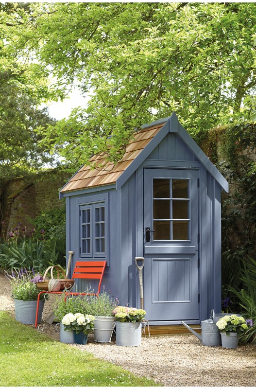
The actual colour I ended up with was this Juniper Ash by Little Green which is shown on this garden shed and is just lovely.
THE MASTER BEDROOM
The master bedroom needed to feel sumptuous, warm, serene and feminine.
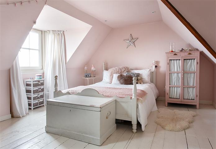
I chose a blush pink as the main colour here and in particular a colour from Little Green called Confetti 274 which is very similar to the on the wall in the picture below.
And, actually, this became the inspirational image for the bedroom which had a ceiling and shape exactly like this. I sourced an antique wardrobe like the one in the picture and had it painted a deeper pink, just like that, but that’s all for another blog post soon!
Kitchen
The kitchen needed to feel bright, spacious, fresh and modern.
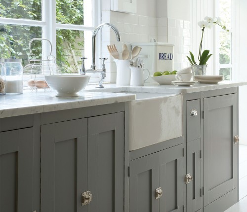
It had light wooden cupboards, so I thought using the grey (Lead Colour from Little Green as shown in the pic below) for repainting them, an off-white on the walls and a green as the accent colour would flow beautifully from the mainly blue living room. This picture is very, very like how it turned out – absolutely gorgeous!
Home Office
Ahhh, the home office, I soooo enjoyed doing this!!
It needed to feel serene and calm, bright, warm and feminine and because it was for a lovely lady I could go all out with that and avoid any horrid officy drabness!
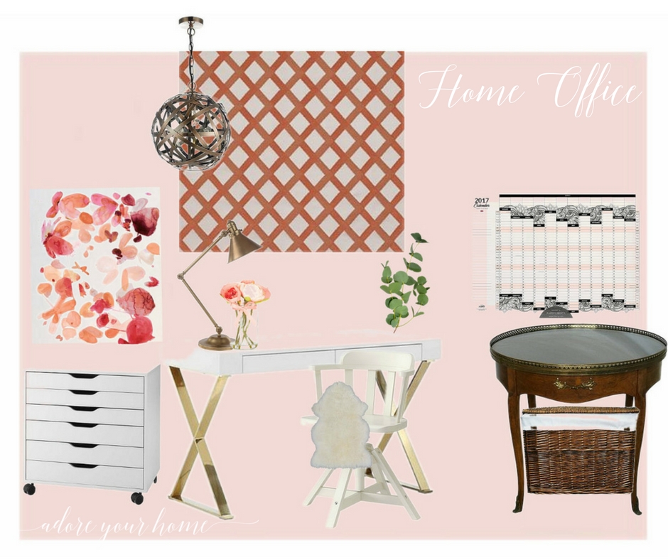
So, I decided to go with the dusky pale pink again but in a shade or two lower than the Confetti and actually went for the Farrow and Ball Calamine. I chose this because one of my favourite colour combos is pink with coral…it’s quite hard to imagine it working, so here’s a little sneak peek at the design board I created for that room!!
The gold legs on the simple desk toned so well with the pink and coral. I added coral in the roman blind which was a trellis patterned silk fabric of pale pink and coral.
And then I chose that beautiful painterly floaty artwork to compliment and tie everything together (that’s the wall print on the left). The picture on the right was an actual year planner for the wall I got on Etsy – perfect colours!
The dark classic mahogany furniture was something my client had already, so I wanted to be able to use it and of course, something like that just adds to the ‘homey’ feel, which is very important.
4. THEN I CHOSE A NEUTRAL
It’s also important to have a neutral colour that you can use anywhere you need to, such as a hallway or landing or even a whole room! It obvs needed to go with the other main palette colours too. I did this by getting a couple of paint colour cards, the most reliable I find are Little Green and Farrow and Ball. They both do a lovely reliable range of all neutrals. And just so you know, neutral doesn’t mean simply beige or magnolia. It means light colours that work well with other darker or more intense colours. All neutrals have an undertone so you need to be careful!
The one I picked was Rolling Fog 143 by Little Green as it looked so good with the blue, pink and green of my palette and is so versatile with furnishings and accessories.
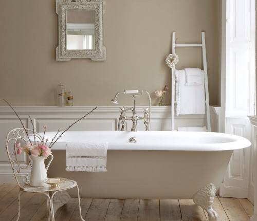
This is it below, a picture from their website, and just look how lovely the pink roses are with it. It ended up being my go-to neutral that I used when picking wooden floors and some carpets, ensuring everything was in perfect harmony!
So, that’s EXACTLY how I chose the whole house paint palette for this home. And it was great because once I had a main colour for each of the rooms that was just the beginning…each room then needed further development and designing, BUT at least I knew the foundations were set and all I needed to do was build on this.
NOW, If you want to learn more about choosing paint and colour and build your knowledge and confidence on how to make better choices of paint, I have a mini online masterclass programme called
Magnolia to Marvellous which you can find out more about HERE. It’s for you if you want better results and to stop wasting money on the wrong colours (you end up living with).
Or, if you want help with your particular room, or even whole house check out my design services HERE. I do on-line interior design package too, as well as in your home.

KEEP READING…
Why A Fresh Coat Of Paint Is Boring
Pick The Perfect Paint Colour Using This 1 Tip
Recent Comments