I get a lot of questions on my facebook page and from readers of this blog, so I thought that it would be great to answer one I got recently all about narrow boring living rooms! The living room is the most social space for most of us, where you bring family and friends into. We want it to reflect our own style (so it looks gorgeous) and be able to have with having the family in there too, so it should also be robust enough for those demands!
Heres the question Tracy sent in…
Hi Heather, I have a long narrow living room which is such an awkward shape and feels cramped and dark as it doesn’t get sunshine through the front window. I want to try and make it feel more square instead of this long shape that it is. And it’s hard to know where to put the furniture so I really need your help.
Thanks, Tracy P.
Right. That is a problem, but one that I can certainly help with. Believe me when I say there is always an issue with room shapes. I rarely come across the perfect one where the windows, doors, electric sockets are exactly where you want them. Every room I work with is a challenge of some sort or another, but it’s all about making the best of it within whatever the budget is, small or not.
So don’t despair Tracy, you are not alone with all this. I have some ideas and suggestions which might help to get this room looking more lovely and feeling less annoying!
So. A long narrow room. Where do you even start? You may not be able to move the walls but you can influence the perception with a few of these tricks and top tips.
USING COLOUR TO HELP MAKE IT FEEL LESS SKINNY
Using colour is a great way to alter the perception. The thing to remember is that lighter colours tend to make walls seem further away and darker colours tend to advance (come towards you) or feel closer. What you could then do is paint the two end walls a darker colour and the two long walls a lighter colour. That will help trick the eye into perceiving it is more square.
But do remember that light colours make things generally feel bigger, so keep the overall ‘look’ fairly light.
What you can do is keep those two end colours a medium colour – enough to be different (slightly darker) from the light long wall colour, but not deep…if you see what I mean…let me explain here…
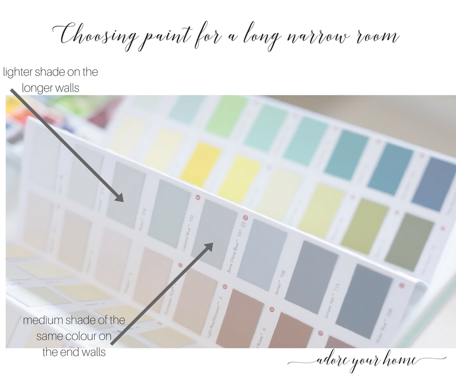
The other colour tip that might help is that if there is an adjoining room, keep the same colour scheme flowing through to it, and certainly the same flooring too.
CAMOUFLAGE THE SKIRTING
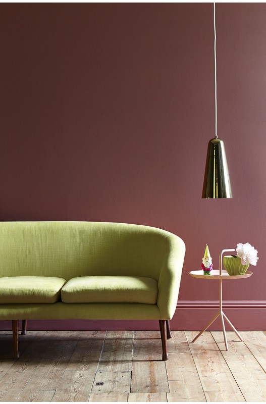
Also, what is really good in a narrow space is to NOT have the skirting boards white. When they are white, they just are more noticeable. If they are painted the same as the walls, (or just a shade lighter) they will just blend more smoothly with the wall so there is nothing to notice. If your eye isn’t interrupted by the sudden contrast as you scan the room i.e. dark wall/white skirting, it will feel more fluid and continuous, therefore more spacious.
Like this picture below.
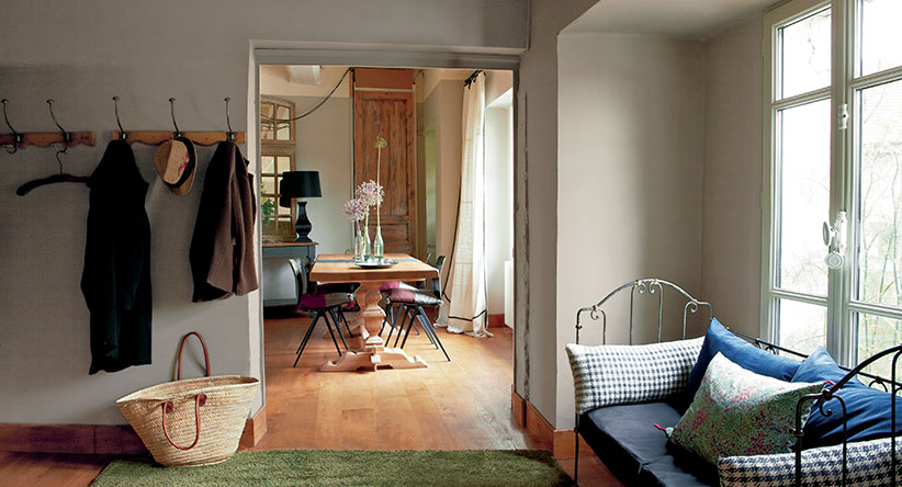
Or if the skirting is the same wood as the floor, it is viewed as if it is part of the floor which helps makes the room feel a bit bigger too.
This is exactly what you want in a narrowish room.
See how this works below where the skirting is really just a continuation of the floor.
SOFAS AND CHAIRS
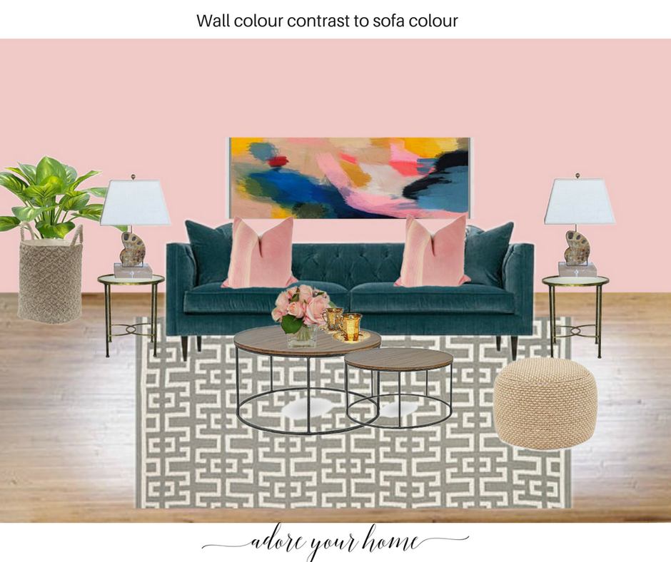
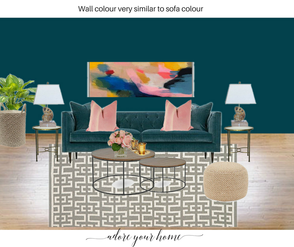
Matching a sofa or chair to the wall colour is a clever idea, especially if you have to put a sofa against a long wall. This layout is the worst case scenario as the sofa is usually the largest piece of furniture and if it is against a long wall it’s really not helping that cramped, narrow feeling. But in some rooms, it just has to be, so this is a workaround!
So, if you already have a sofa think about painting the wall a very similar shade unless it’s a black leather sofa, then this tip isn’t for you!
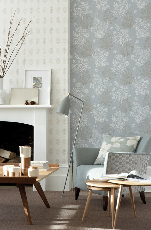
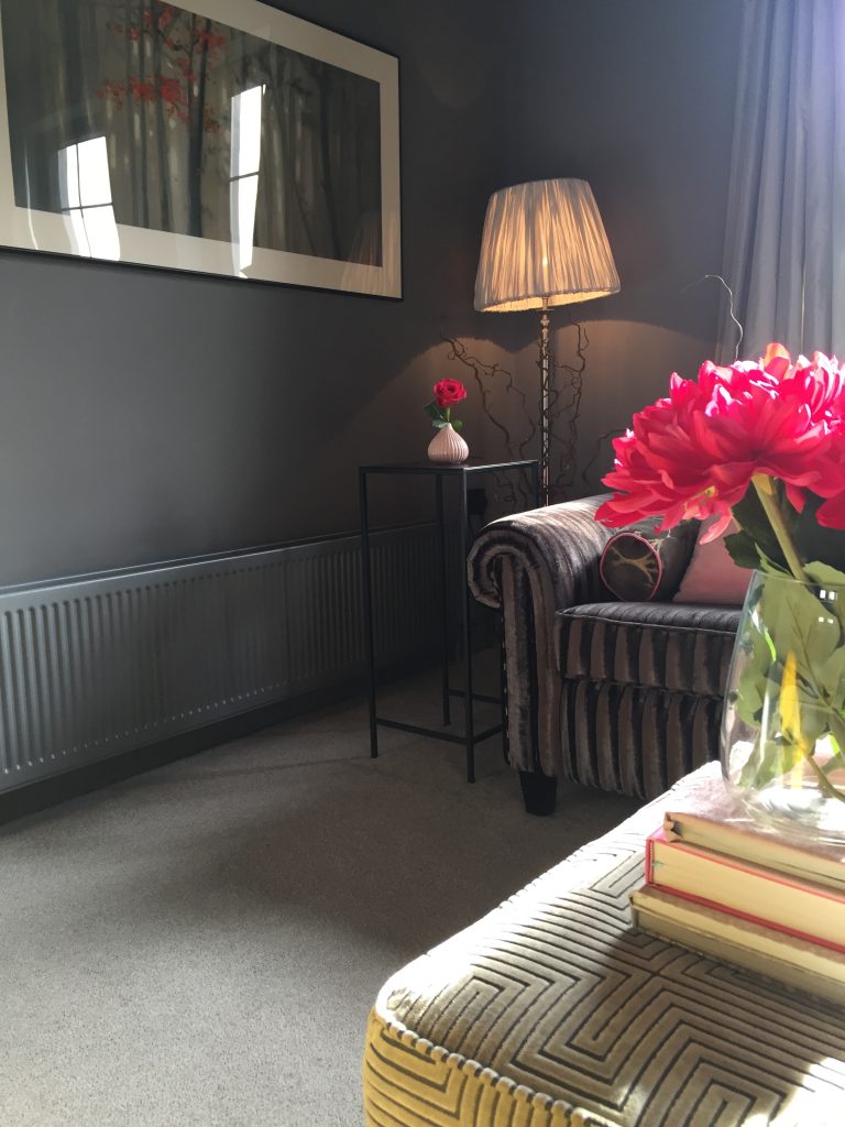
You can see what I mean, a bit, in this pic below, where the chair fabric (and the floor lamp) are the same as the colour in the wallpaper background. The seat sort of merges into the wall so well you could almost miss it.
If you have to buy a sofa or get one recovered, now is the time to branch out into choosing a coloured one!
These mood boards below might help explain the idea a little bit more!
INVISIBLE FURNITURE
And if your sofa has to be along the long wall, a great idea is to have a glass or perspex coffee table in front of it, which just vanishes, kind of.
Not entirely, but if you can see the floor through the coffee table, it will feel more spacious.
See the how the glass coffee table in this room lets you see the floor so things don’t feel cramped. This is a great idea for a small room or narrow space like we’re talking about.
This trick also works where dining areas are a bit tight – using those ghost chairs (with a normal table), or any clear acrylic chair can look really stylish as well as feel less cramped.
WHICH WALLPAPER?
Absolutely avoid horizontal striped wallpaper on the long walls which will just make the room look a mile longer than it is. But, you could use it on the narrower walls which will widen them. I have to say I’m not a huge fan of stripes, I know they can look amazing, but they’re just too much for me to live with.
Don’t, however, let me put you off!
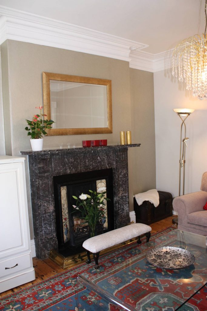
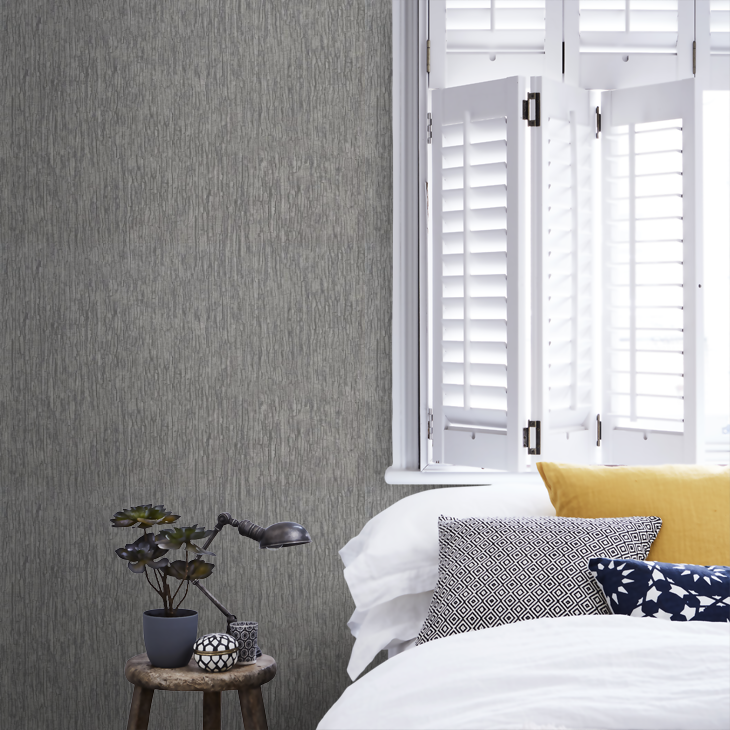
If painting the room (like I suggested above) feels a bit bland, you could add visual interest by using a subtle patterned or a textured wallpaper. This picture I found below shows how a bit of texture can be a bit cosier than if the walls were just painted in that same grey colour.
WHITE RADIATORS?
If there are any radiators in the room, I’d paint them the same as the walls so they aren’t noticed. This is really important if there is one on the long walls.
Here’s one of the rooms I designed and made double sure that the radiator was painted same as the walls…can you imagine if it had been white?!?
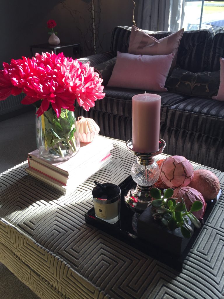
This is a view of the same wall when sitting on a sofa, so you can see how much the radiator just vanishes when it’s totally played down and other things are played up!
(And take a look at the styling arrangement on the ottoman while you’re there!)
CEILINGS
If the room feels quite small and claustrophobic, paint the ceiling a light, or off-white colour which is what most of us do anyway. But, on the other hand, if your ceiling is quite high and the room feels too lofty, if you paint the ceiling a darker shade than the walls it will seem cosier. Depends on the style of your house, modern or traditional.
LIGHT IT UP
You said it feels dark so what you should do is to keep curtains right back so they hang over the wall and just a very slight bit over the edge of the window…you’re trying to allow as much daylight in as you can. (No vertical blinds, or any blinds either).
The more light you can get in this room, the better and bigger it will feel. So, it sounds like you have to rely more on artificial sources. Lighting up corners with a floor lamp works well and generally adding more lamps on side tables and shelves will help to softly illuminate the room.
If you have a fireplace you could paint it in the same colour as the walls to massively make it blend away more. Or if you have used the subtle wallpaper I mentioned, paint it in the background colour in the wallpaper. This will create a beautifully calm focal point which has a much-reduced impact on the room than a wooden fire surround would have. And reducing impact is what will create the illusion of more space.
Then put a large gorgeously decorative shiny-framed mirror above it! The mirror will create drama and a fab focal point!

MORE ABOUT FURNITURE
Keep furniture items to a minimum but dress and accessorise what you do have. And, particularly as the room is narrow keep any furniture (maybe the sofa) that has to go against the long walls, finer and not chunky! Big wide-armed sofas are going to just take up way too much space, all you need is a simpler one. Ideally with visible thin legs that mean you can see underneath it more than those solid based sofas.
The more actual floor the eye sees the more space it perceives.
LAYOUT
And try to zone the room. Having a rectangular dining table at one end could really look good as the long narrow shape of the room is perfect for the table shape. Then you could use the sofa as a room divider (facing the other way) opening into the seating area.
Any free-standing shelves or cabinets should be placed on the short walls. Even wall shelving is better on these to help detract from the skinniness!
STYLING
You have probably heard it before, but small dinky accessories can look cluttered. Try to make picture groupings on the wall as a way of adding interesting things, rather than lots of ornaments.
You can try some clever group-styling of tables or shelves, check out my blog all about How To Add Finishing Touches To Your Home With My Creative Styling Tricks here.
And a final tip, I mentioned a shiny framed mirror…shiny, glossy, metallic surfaces all help to bounce and reflect that much-needed light, so introduce some. Metallic lamp bases or shiny glossy styling trays, that sort of thing!
Hope that helps Tracy and anyone else with similar issues!
My free ebooks are below which have lots more of my general interior tips and by signing up for them you’ll also get my newsletter with all my behind-the-scenes stuff and my special offers that I let my lovely subscribers in on first!


Recent Comments